Why a Limited Palette Makes Creative Time Calmer (and Better)
Quick Answer: A limited palette - typically three colours plus white - removes the largest source of decision fatigue in creative practice and produces work that looks more cohesive, because every colour shares a common origin. For anyone using art for stress relief rather than output, fewer choices reliably means more time in the calm, absorbed state you were there for.
You bought the 24-colour set because more options seemed generous. Then you spent the first twenty minutes of every session deciding, and the sessions started feeling like work.
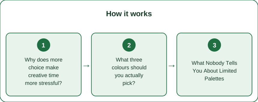
Why does more choice make creative time more stressful?
Because every choice costs the same mental resource that absorption requires.
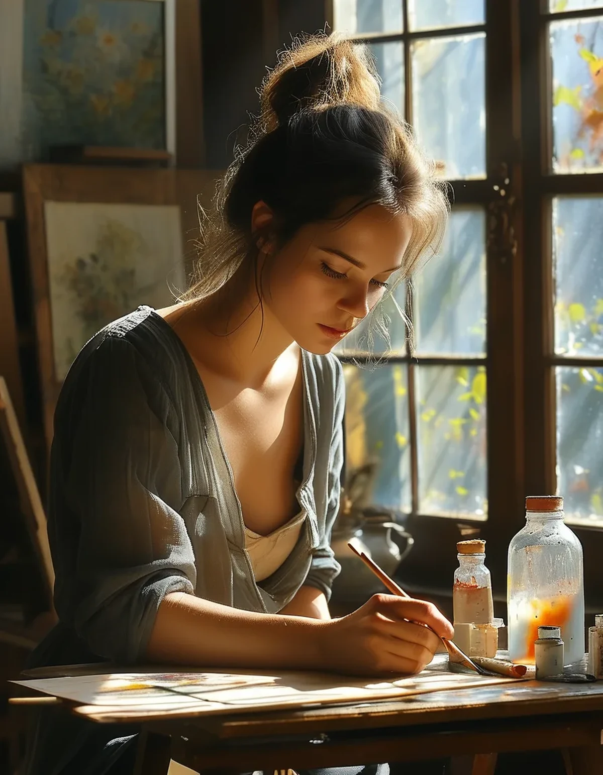
The calm people describe from drawing or painting comes from a state of sustained attention on a single task - what’s often described as flow. Flow requires the next action to be reasonably clear. Every time you stop to choose between six similar greens, you exit that state and have to re-enter it.
With 24 colours, the choices are constant: which green, which blue, should I mix or use it straight, is this the right one. Each decision is small. There are hundreds of them in an hour.
With three colours, the choice collapses. You’re not choosing which colour to use - you’re choosing how much of each to mix. That’s a doing decision rather than a selecting decision, and doing decisions don’t break flow the way selecting ones do.
The counterintuitive result: most people find a limited palette produces more varied-looking work than a large one, because they actually mix rather than reaching for the nearest ready-made match. Twenty-four tubes tend to produce twenty-four flat colours.
What three colours should you actually pick?
A split-primary or a simple limited triad. Both work; one is more flexible.
Option 1: The classic triad
- One red - a mid red such as cadmium red or naphthol
- One yellow - a mid yellow such as cadmium or hansa
- One blue - ultramarine or phthalo
- Plus white if you’re using opaque media
This mixes an enormous range and is the standard starting point. Its limitation: clean purples and bright greens are hard, because each primary leans toward one neighbour.
Option 2: The earth triad - the calmest of them all
- Burnt sienna
- Ultramarine blue
- Yellow ochre
This mixes a beautiful muted range including a genuinely useful near-black from sienna and ultramarine. Everything harmonises automatically. For calm-focused practice specifically, this is the one to start with - it’s almost impossible to make something that clashes.
Option 3: Two colours only
One warm, one cool - ultramarine and burnt sienna is the classic pair. Extremely restful, and enough for a huge amount of work.
Whichever you choose, decide before the session starts. Choosing the palette is itself a decision; making it in advance is half the benefit.
What Nobody Tells You About Limited Palettes
Four things that only become obvious after a few weeks.
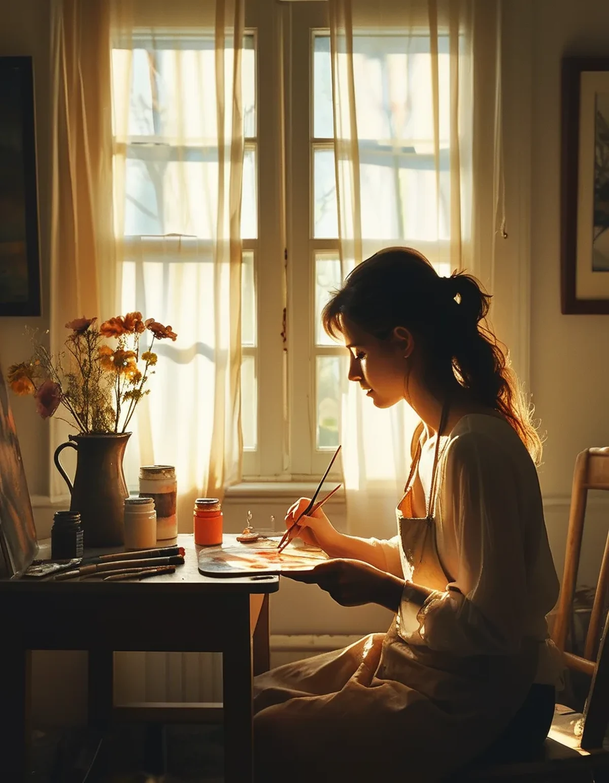
Your work suddenly looks like it belongs together. Because every colour on the page contains some of the same three pigments, everything harmonises without any effort on your part. People often assume they’ve improved at colour theory. They’ve mostly just removed the ability to clash.
Mixing is where the skill actually develops. Reaching for a ready-made green teaches nothing. Mixing a green from blue and yellow, twenty times, teaches you what those pigments do - and that knowledge transfers to any palette you use later.
You’ll use far less paint and far fewer supplies. Three tubes used properly outlast a 24-set used occasionally, because paint dries out unused. This matters more than it sounds for anyone whose creative hobby stalled over the cost of restocking.
The restriction stops feeling like a restriction around session four. The first two sessions feel limiting. By the fourth, most people describe it as a relief - and it’s this point that people who try it once and give up never reach. If you’re going to test this, commit to four sessions rather than one.
How do you set up a session that stays calm?
The palette is one of several decisions worth making before you start rather than during.
Decide in advance, the night before or as a fixed default:
- The palette - three colours, chosen
- The surface and size - one size of paper, always. A5 or A6 is small enough not to be intimidating.
- The time - a set length, ideally with a timer. 20-25 minutes is enough to reach absorption and short enough to repeat regularly.
- The subject - or a default source, such as a single photo, an object on the table, or simply colour with no subject at all
What to physically remove from the table: everything not on that list. Visible options are decisions waiting to happen. A drawer with 24 tubes in it costs you nothing; the same 24 tubes on the table cost you the session.
The one rule that protects the calm: no evaluating during the session. Turn the page over when you finish and look at it the next day, or don’t look at it at all. Evaluation is the fastest route from this is restful to I’m not good at this, and it’s what ends most creative hobbies within a month.
FAQ: Limited Palette Questions, Answered
Does this work for coloured pencils and markers too?
Yes, and arguably better - a set of 60 markers is the most decision-heavy medium there is. Pull out three or four and put the rest away. Pencils layer rather than mix, but the principle holds.
Won’t my work be boring with only three colours?
The opposite is more common. Three colours produce a huge mixed range, and the shared pigment base makes everything look intentional. Historically, plenty of well-regarded painting was done on very restricted palettes for exactly this reason.
What if I already own a big set?
Keep it - just don’t have it out. Choose three for the session and put the box away. You’re not throwing anything away, you’re just not deciding.
How long should I stay on one palette?
A few weeks is a good stretch - long enough to learn what those three pigments do together. Changing palettes weekly puts you back into choosing, which is what you were trying to escape.
TL;DR:
- Large palettes break flow through constant small selection decisions
- Three colours - or two - collapse choosing into mixing, which doesn’t break absorption
- Burnt sienna, ultramarine, and yellow ochre is the calmest starting triad
- Decide palette, size, time, and subject before the session; remove everything else from the table
- Don’t evaluate the work during the session - that’s what turns restful into discouraging
- Give it four sessions; the first two feel limiting and the fourth feels like relief
The supplies were never the bottleneck. The decisions were, and three tubes remove almost all of them.
Keep Reading
This article is for general informational and styling purposes only. Fit, sizing, and product availability may vary.